TempStars: Building marketplace liquidity for 25K+ dentists
Building trust in a marketplace for dental professionals
Role
Lead Product Designer, Research
Timeline
Shipped 2023
Team
Cross-functional
Platform
At a glance
- •Impact: 20% increase in user activation and a 25% YoY increase in booked shifts.
- •Velocity: Reduced time-to-first-offer from 7 days to 2 days.
- •Policy: Ran workshops with founders to revise cancellation rules that were pushing hygienists away.
- •Systems: Replaced a generic signup flow with progressive onboarding tied to skill-based matching.
Overview
Context and rationale
TempStars is Canada's largest dental staffing platform. When I joined, 40% of signups never booked a shift. The product looked dated, the business rules were unclear to users, and hygienists didn't feel like the platform was working in their interest. My job was to understand why people weren't coming back and fix the underlying problems.
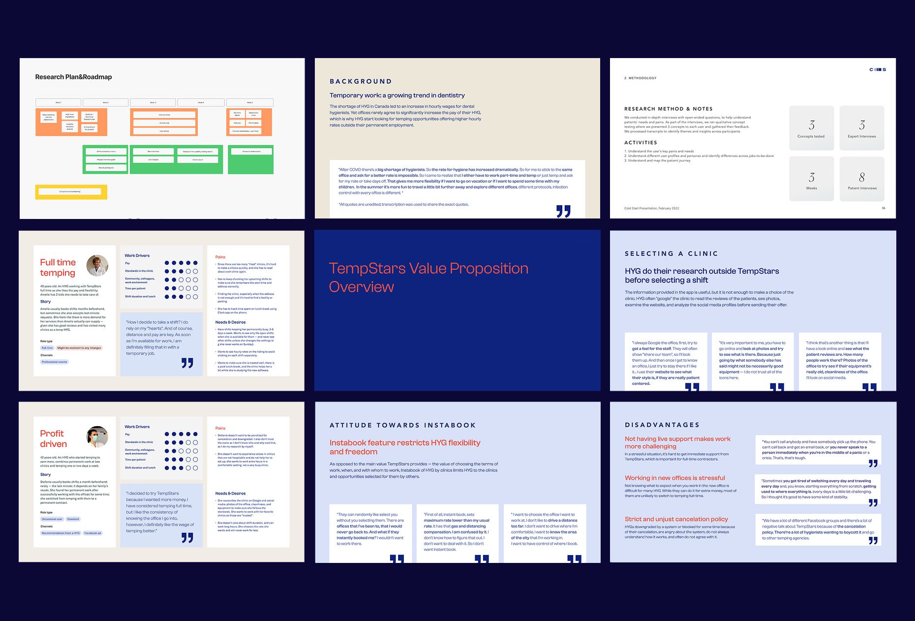
Research
Finding the root causes
I ran a mixed-methods research to move beyond surface-level symptoms - mapping the full service experience, not just the app.
Policy friction
Interviews revealed that cancellation policies were punitively one-sided toward clinics. This destroyed platform trust before a user even worked their first hour.
Low information scent
The "search" experience didn't account for the specialised mental models of dental professionals. A hygienist isn't looking for any job; they are looking for a specific clinical environment.
Cancellation policy friction - journey mapping session
Discovery
Understanding inactive users
I started by mapping the end-to-end user journey to understand where people were dropping off. The problems were concentrated in the first 48 hours after signup.
The 40% drop-off: Users were registering but not booking. Some were put off by the cancellation policy before they even took a shift. Others simply didn't have enough information to feel confident applying.
Missing context: Users were leaving the app to look up dental offices on Google before applying, because shift cards didn't include the details they needed - parking, equipment, team size, office culture.
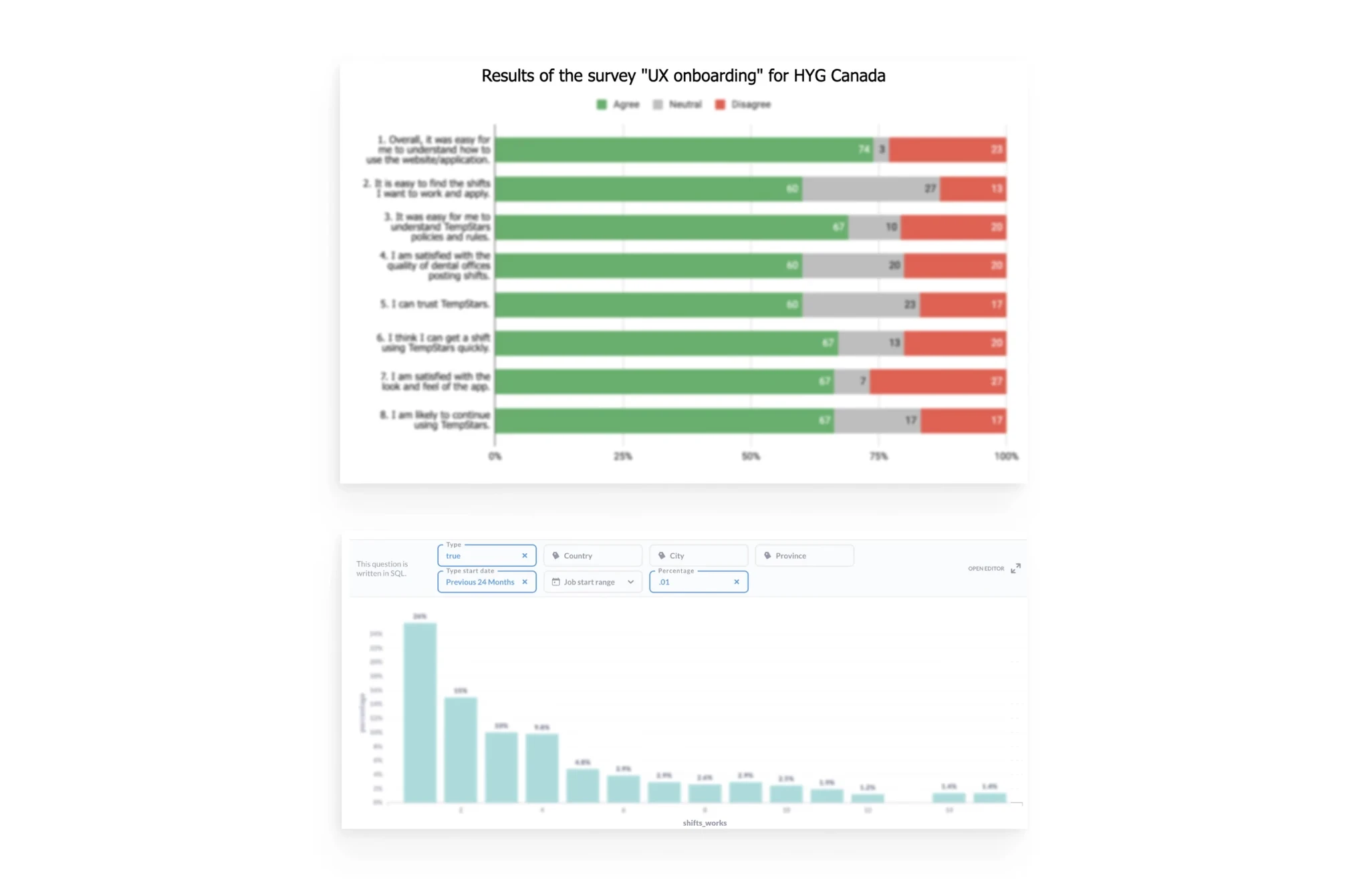
UX onboarding survey (HYG Canada) and shifts distribution
Collaboration
Collaboration with the team
Weekly feasibility sprints
We ran weekly feasibility sprints where I shared lo-fi wireframes of the matching logic before high-fidelity design began. This prevented us from designing matching filters that the database couldn't query in real-time.
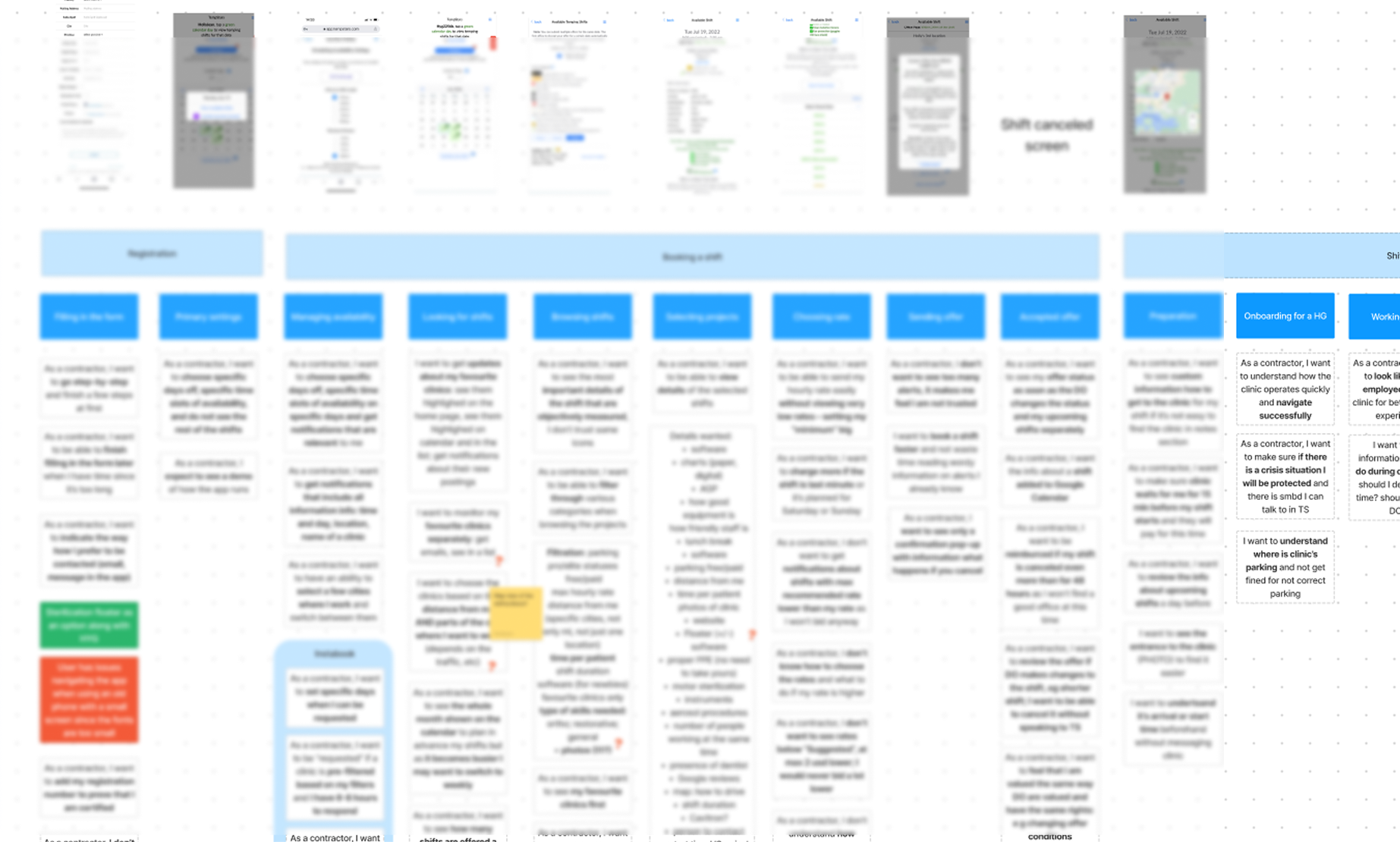
I also shared service blueprints, customer journey maps, and issue priority maps with the team to keep everyone aligned on the full picture - not just the screens.
Service blueprints and customer journey maps shared with the team
Solution
Rolling it out in phases
Stakeholder negotiation & policy reform
I ran workshops with the founders to revisit the cancellation policy. The existing rules were heavily weighted toward clinics, and hygienists knew it. I made the case that retaining hygienists mattered more than the short-term fee revenue - a churned office represented around $12k in lost LTV over 12 months. The policy change improved sentiment quickly in our beta group and unblocked a lot of users who had been hesitant to commit.
Workshop session - revisiting cancellation policy with founders
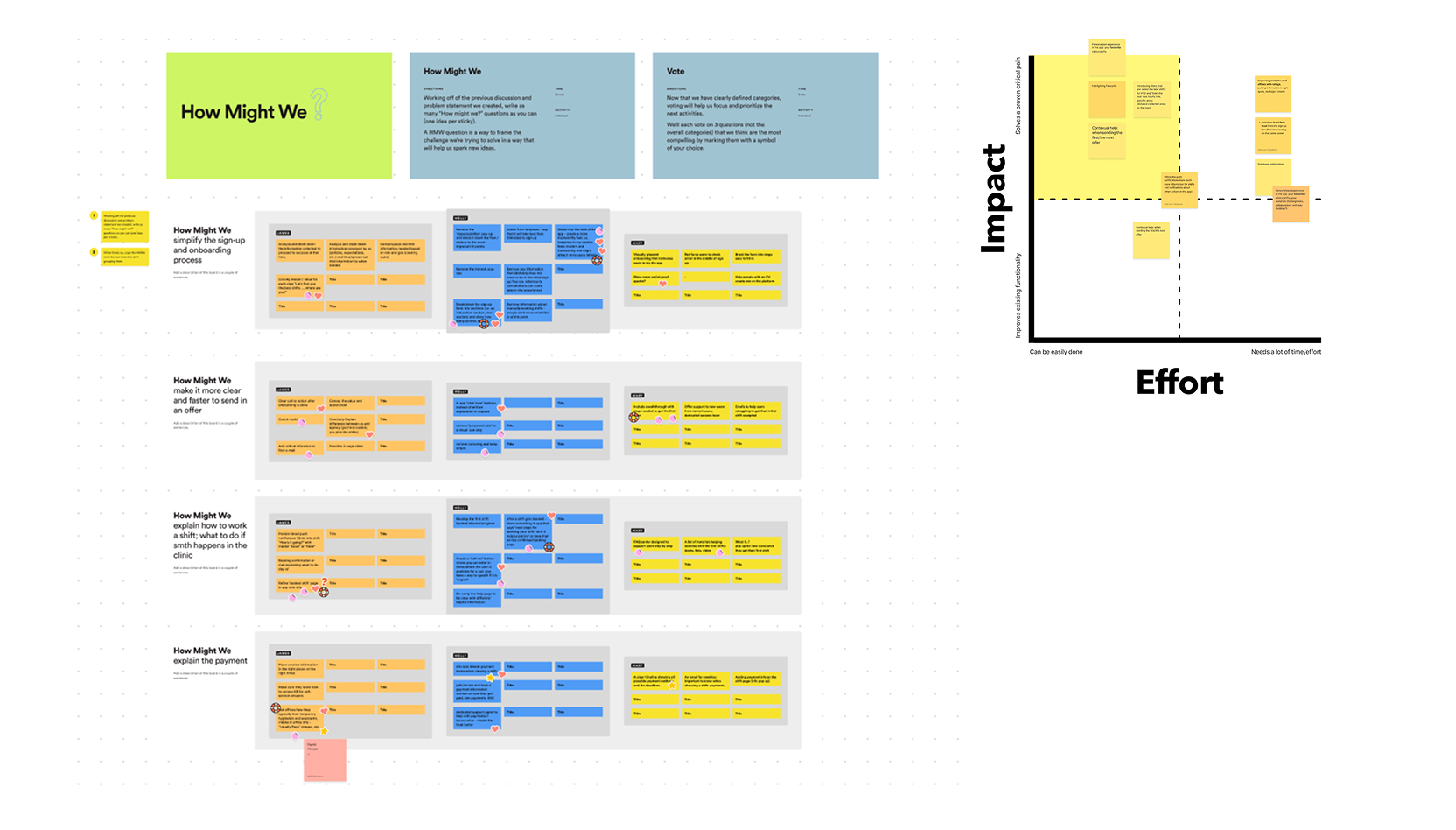
Broad ideation before convergence
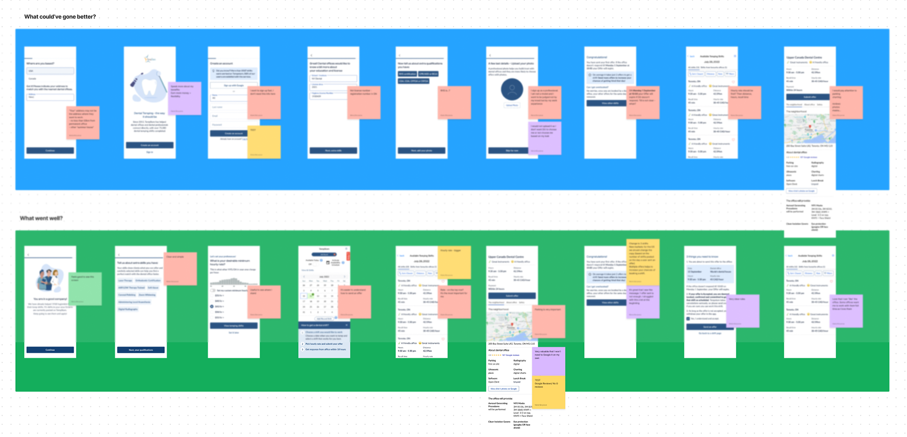
Before committing to a direction, I generated 10+ distinct design approaches to the core problem. I shared these broadly - with the team and with power users - to gather early signal on what resonated before investing in high-fidelity work. This helped surface assumptions quickly and avoided anchoring too early on any single solution.
10+ design approaches explored before converging on a direction
Contextual onboarding (progressive disclosure)
We replaced the one-size-fits-all signup with a shorter, staged flow. By capturing specific skills early - software experience, equipment familiarity - we could show relevant shifts straight away rather than presenting an undifferentiated list. Fewer steps upfront, but more useful results on the other side.
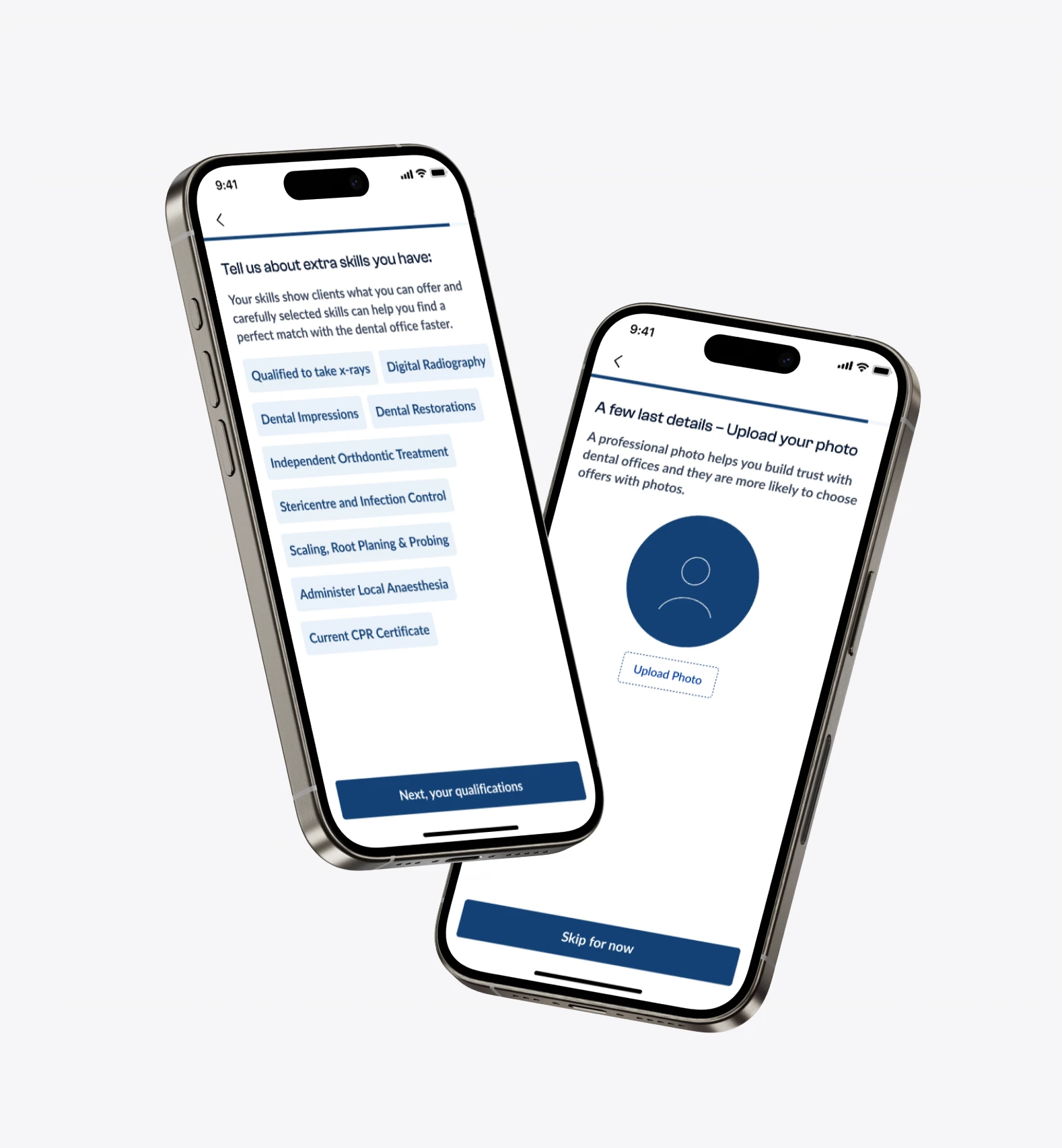
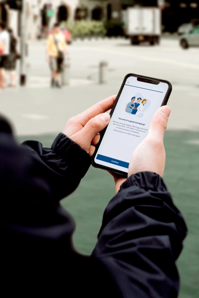
Skills selection, photo upload, and social proof screen
I collaborated with Engineering to move from free-text skills to a standardised skill taxonomy. This allowed us to build a weighted matching algorithm. I defined the UX logic for "hard skills" (must-haves like experience with specific equipment) vs. "soft preferences" (nice-to-haves like specific software knowledge).
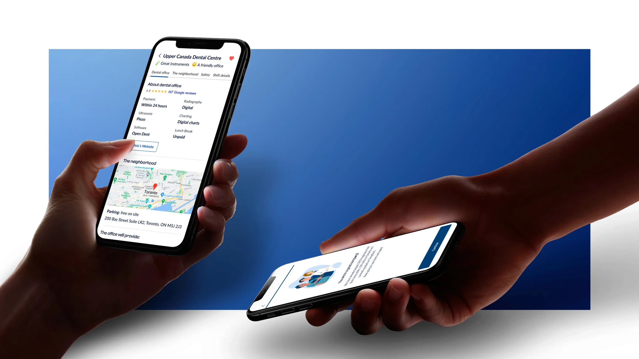
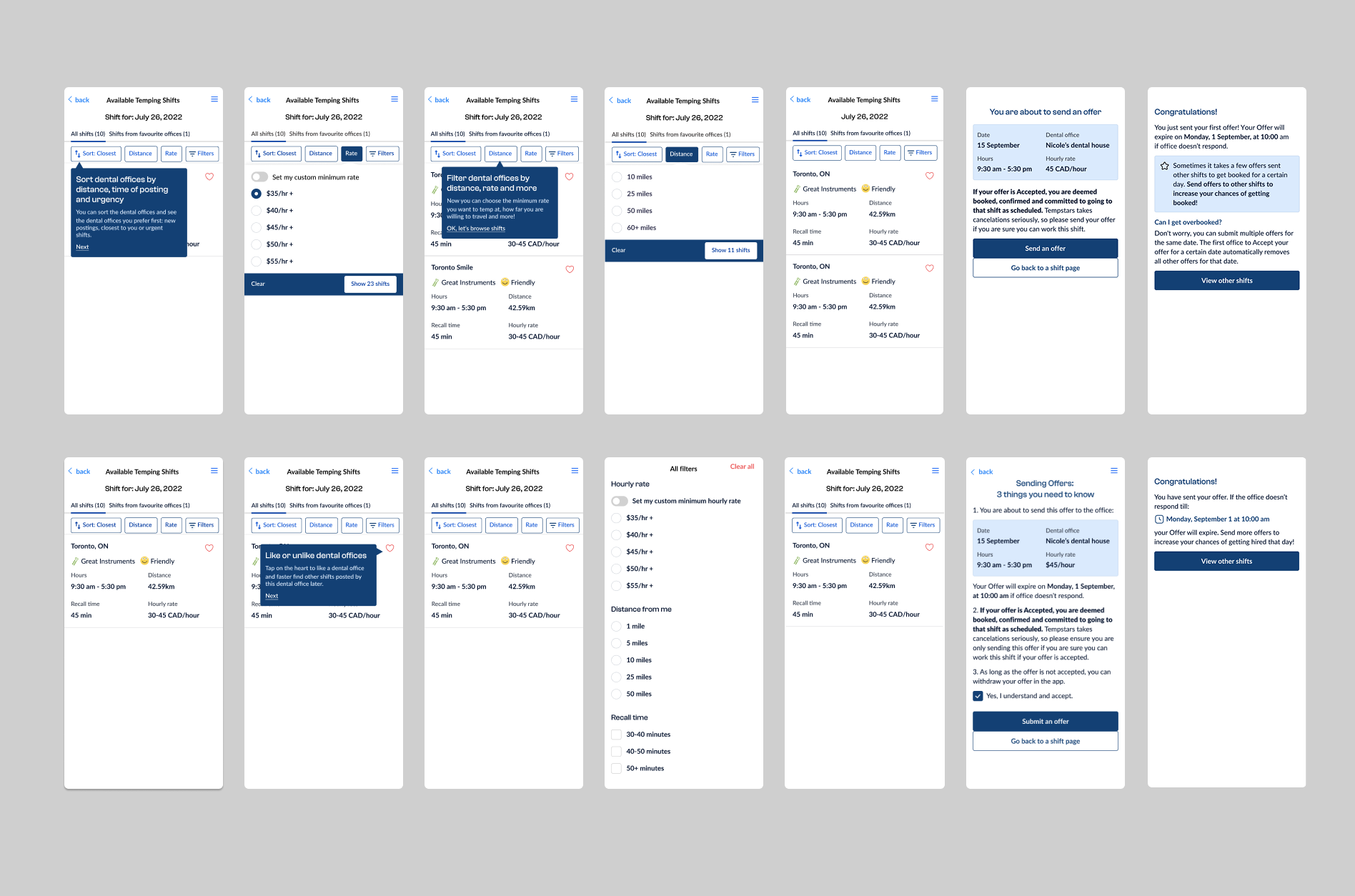
I restructured the shift detail page to surface the information hygienists actually needed before applying - clinical setup, office culture, parking, location context. The goal was simple: stop users having to leave the app to make a decision.
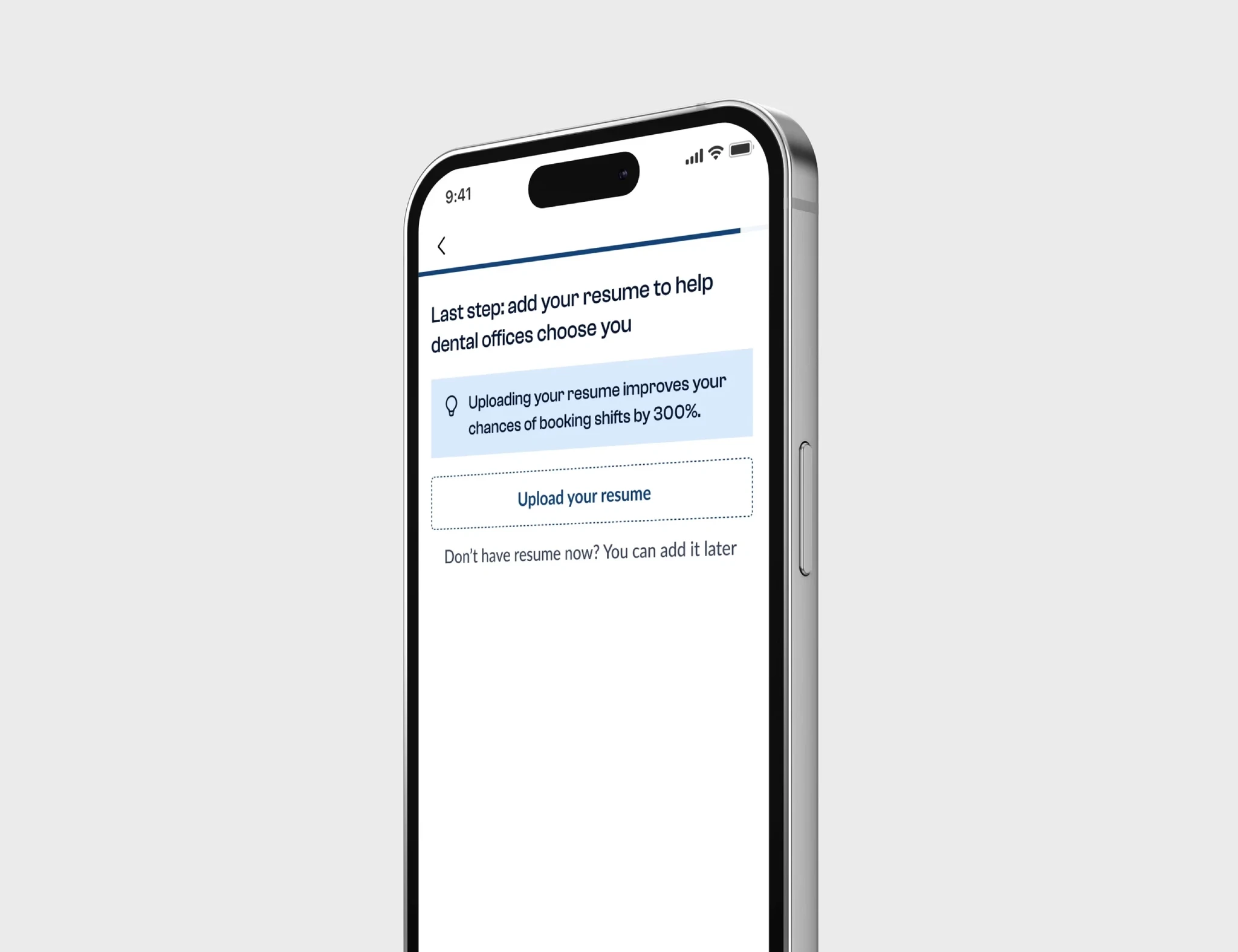
Redesigned shift detail page and resume upload step
Edge-case logic
I designed the logic for partial matches. If no 100% match was found within 10 miles, how should the system decay the constraints? I mapped the hierarchy prioritising license verification over proximity to ensure patient safety while maintaining fulfillment rates.
Usability testing
I ran usability testing on the redesigned flow with 8 participants - a mix of occasional, regular, and frequent users. No critical issues were found. Key feedback shaped two refinements:
- •Parking information should be surfaced at the top - users cited it as a deciding factor before they even looked at pay.
- •Hygiene detail was being skipped by a significant number of users, so it was moved lower to reduce visual noise on first scan.
Usability testing findings - hygiene detail placement and parking priority
Roadmap
Stages set in motion
The Fix
Scaling
Ecosystem Expansion
Outcomes
The impact
Lift in activation (signups → active workers)
Velocity
Time-to-first-offer: 7 days → 2 days
YoY increase in booked shifts
20% lift in activation: More signups converted to active workers. Fewer people were bouncing at the policy or the onboarding stage.
Velocity: Time-to-first-offer dropped from 7 days to 2 days, mainly because the matching was more targeted from day one.
Booked shifts: Up 25% YoY. A combination of more active workers in the system and shifts being easier to evaluate and apply for.
Reflection
Lessons in design leadership
Starting with service mapping rather than jumping into UI meant we caught problems that wouldn't have been visible from the screens alone. The cancellation policy was the clearest example - it was a bigger blocker than any UX issue, and no amount of onboarding polish would have fixed it. Getting that sorted first made the rest of the work land properly. The main thing I'd take from this project: operations decisions and design decisions are often the same decision.