0→1 · Personal Finance · AI
Squirll: Defining the Design Language and Brand Expression
A 0-to-1 AI finance platform. One designer, two founders, seven months.
Role
Lead Product Designer
Timeline
Sep 2024 – Apr 2025
Team
2 founders, PM, 3 engineers
Platform
Context
Building a finance app from scratch
Squirll is an AI-driven personal finance platform that connects to your accounts, reads your patterns, and surfaces what matters automatically. I joined as the sole designer on a contract basis, working directly with two founders, a PM, and a team of three engineers.
Approach
Finding our position in the market
Before any visual direction, I ran a competitor audit across the personal finance category - Copilot, Monarch, YNAB, Cleo. The pattern was consistent: products defaulted to either clinical white interfaces that felt like banking portals, or playful illustration systems that undersold the intelligence of the product. Few were occupying the premium, low-arousal space in between.
That gap shaped everything that followed.
Design principle
“The product should feel like a premium spa.”
Not a dashboard, not a financial tool but an environment where the user arrives and immediately feels that something capable is handling things, without being asked to do anything themselves. Defined before any visual work began, I presented to founders and PM as a filter for every decision that followed.
Early direction drafts
Research on arousal and interface design informed this directly. Dark backgrounds lower arousal, reducing the alertness and vigilance that light backgrounds trigger. The implicit message across light-background finance apps is: pay attention to this. The implicit message we were designing toward was the opposite – this is already taken care of. That framing became the filter for every visual decision that followed.
Color
Exploring two color directions
I explored two palette directions and brought both to the team. We iterated on both across several sessions with the founders and PM.
Warm dark
Feels like the product is on your side. Amber signals trust, not assessment.
Deep blue
Category default – credibility borrowed from convention, solving the wrong problem.
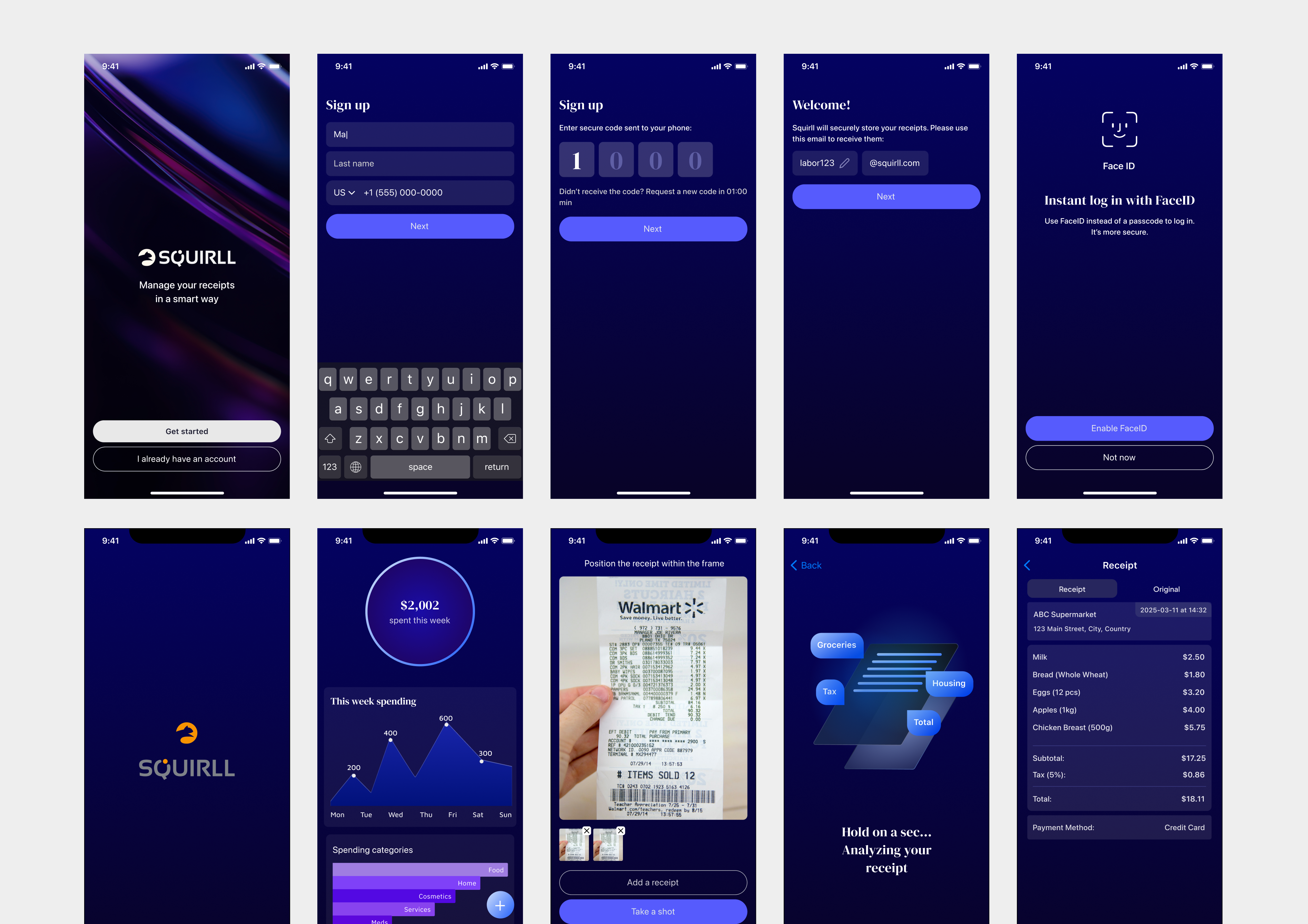
Color direction exploration
The blue had an argument behind it: credibility borrowed from category convention, a trust signal. But the more we worked through it, the clearer it became that it was solving the wrong problem. Squirll wasn't competing with banks - it was competing with the anxious, approximate version of money management people do in their heads.
Warm dark palette applied
The near-black base removes the aesthetic memory of bank statements and spreadsheets, the associations people carry from every finance tool they've already abandoned.
Typography
Choosing the right typefaces
Sans-serif carried all functional UI – readable, neutral, nothing in the way. DM Serif Display came in for titles and insight headlines only: the moments where the product needed to feel like it was saying something that mattered, not just displaying data.
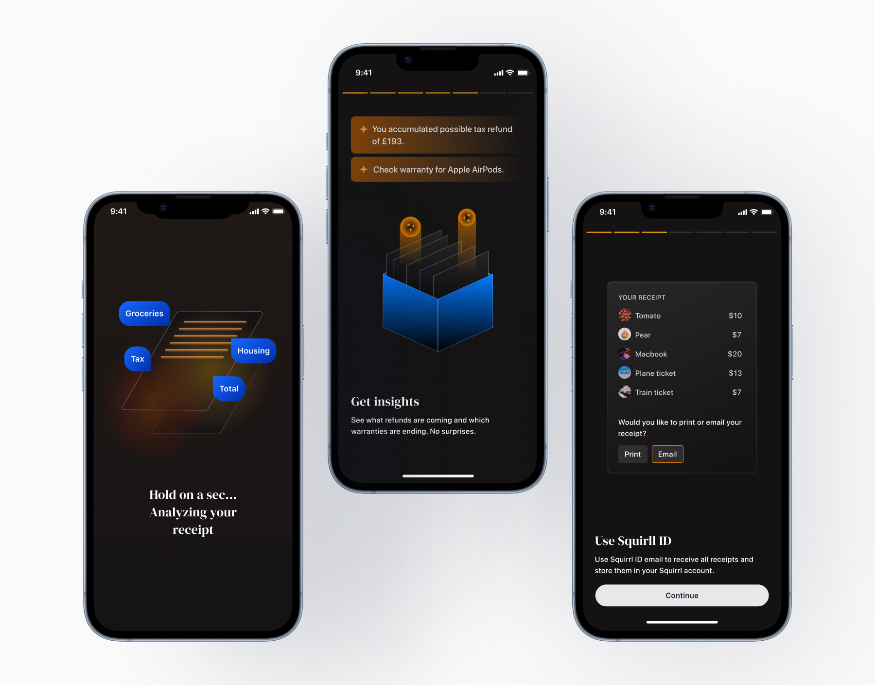
3D AI insight illustration
Illustration
Building trust through illustration
For the insights screen I chose 3D over flat, because flat illustration has become so widespread in consumer software that it's stopped carrying meaning. Three-dimensional form creates associations that flat can't manufacture - depth, layers, intelligence operating beneath the surface. The cobalt blue of that illustration is the only cool tone in an otherwise warm palette, deliberately separating what the AI is doing from what the user sees as a result.
Animated onboarding illustrations - orbital radial glow and account-linking motion
Onboarding orbital illustration
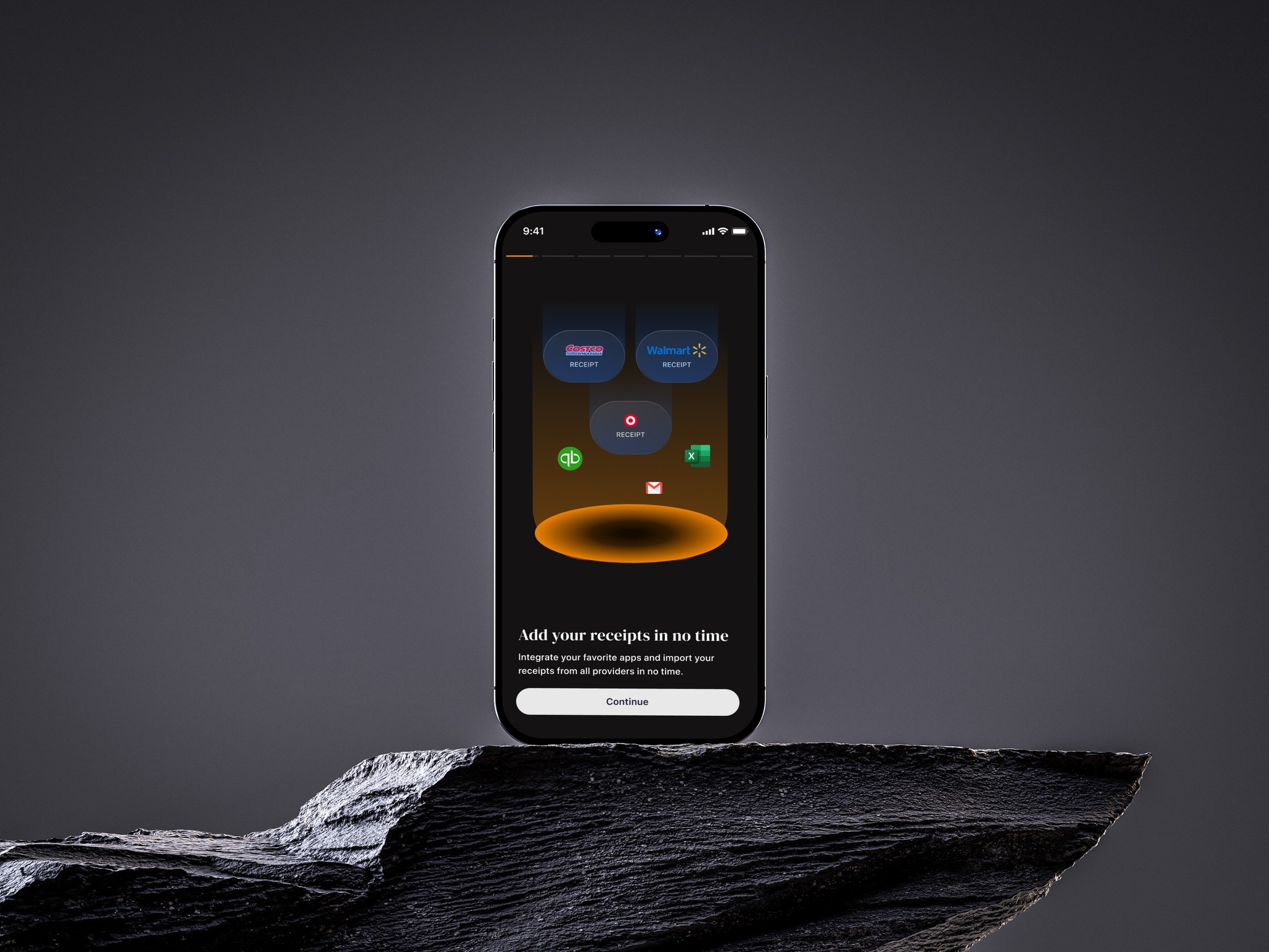
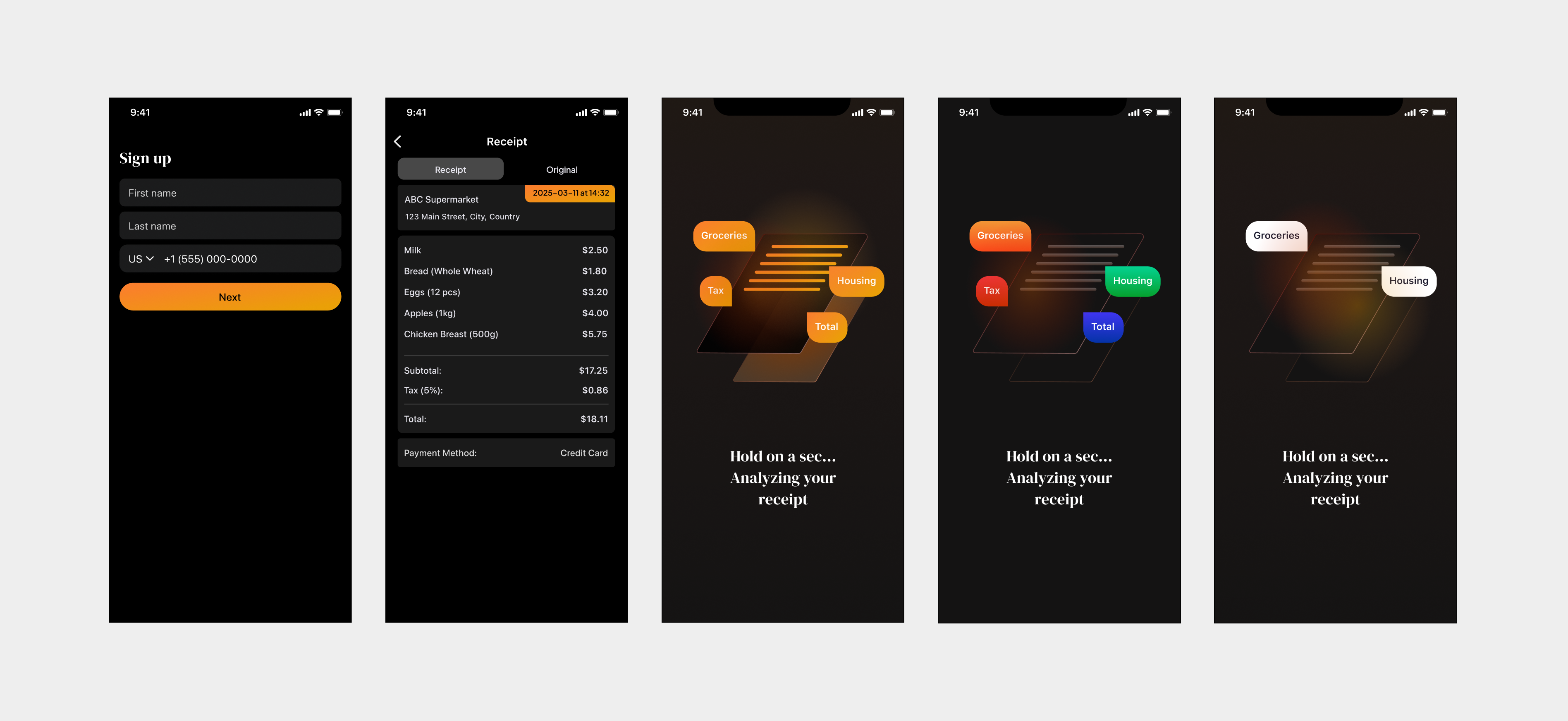
Uploading a receipt flow
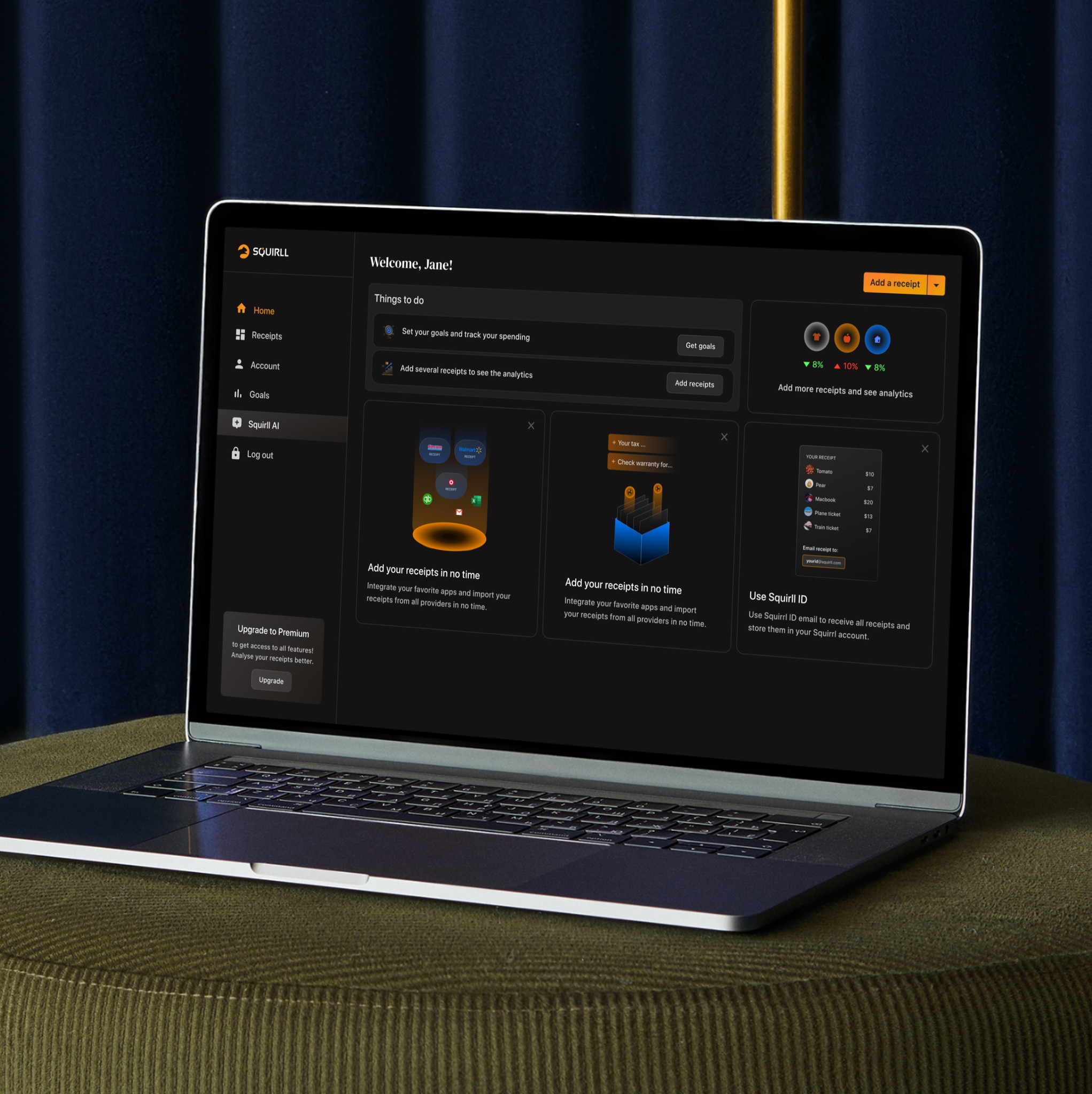
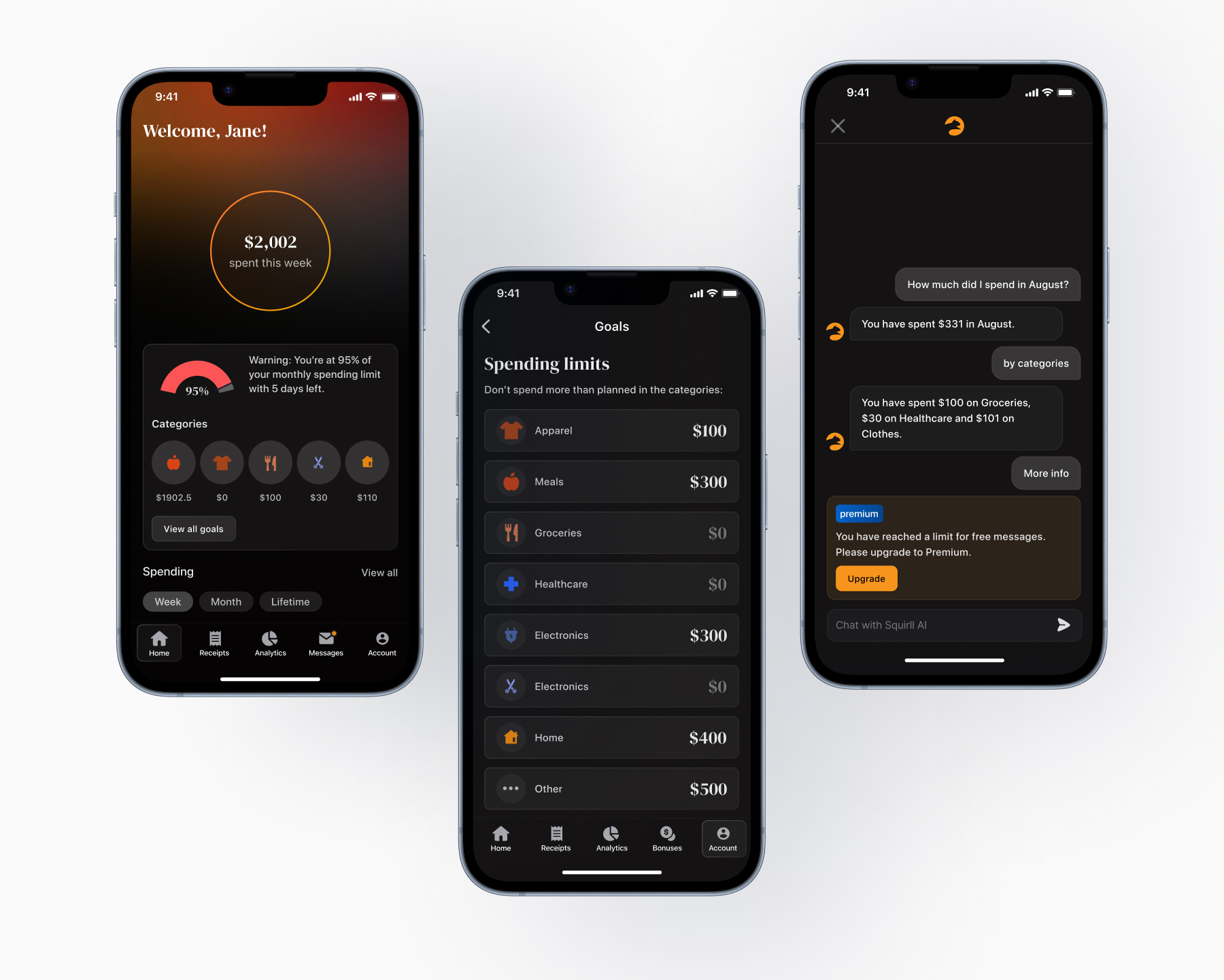
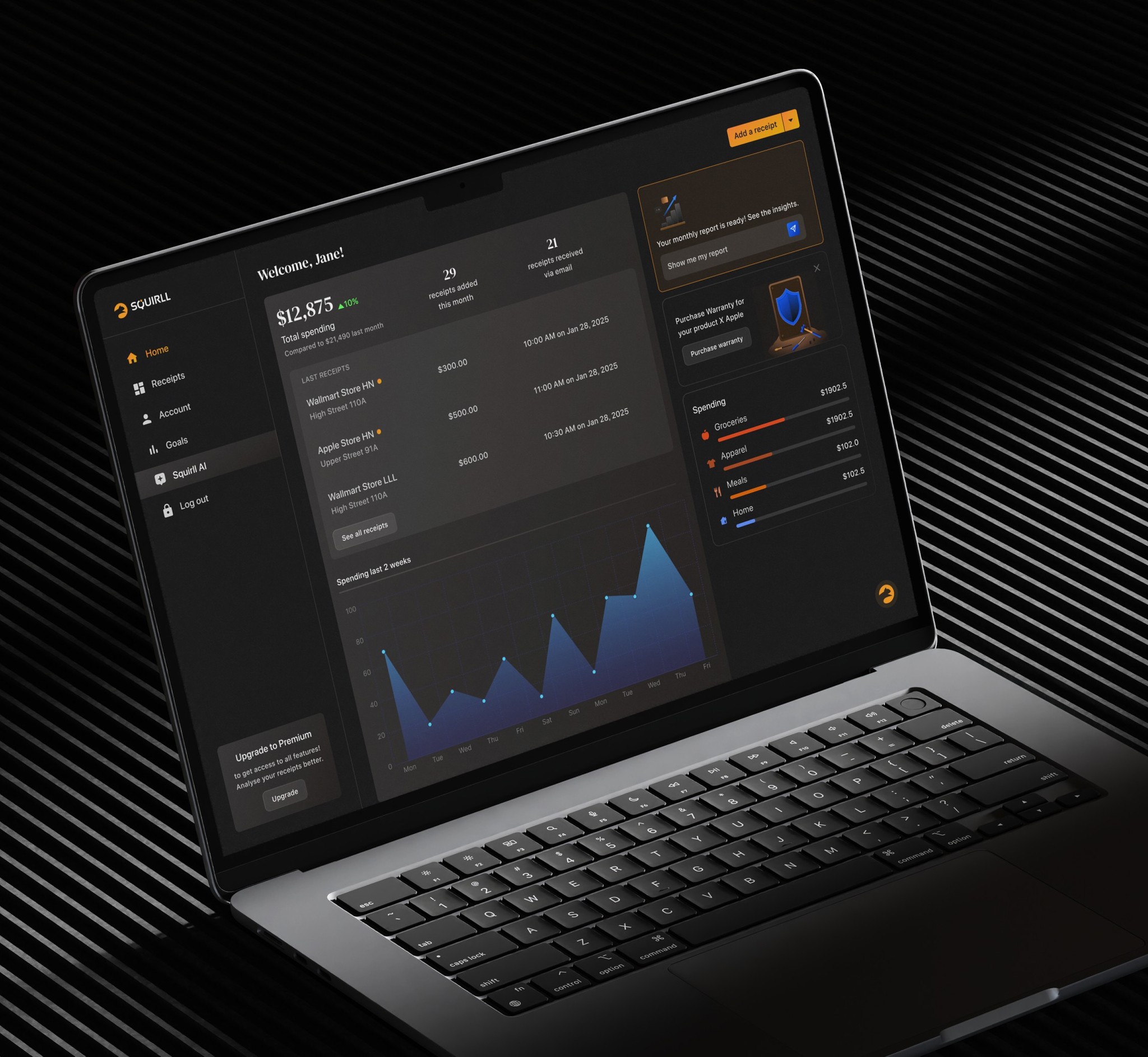
Dashboard
Designing the dashboard
The glowing circle at the centre of the dashboard is doing one thing: lowering the user's guard. Before any number is read, the composition signals that this is a calm environment – something is in control, and it isn't asking anything of you yet.
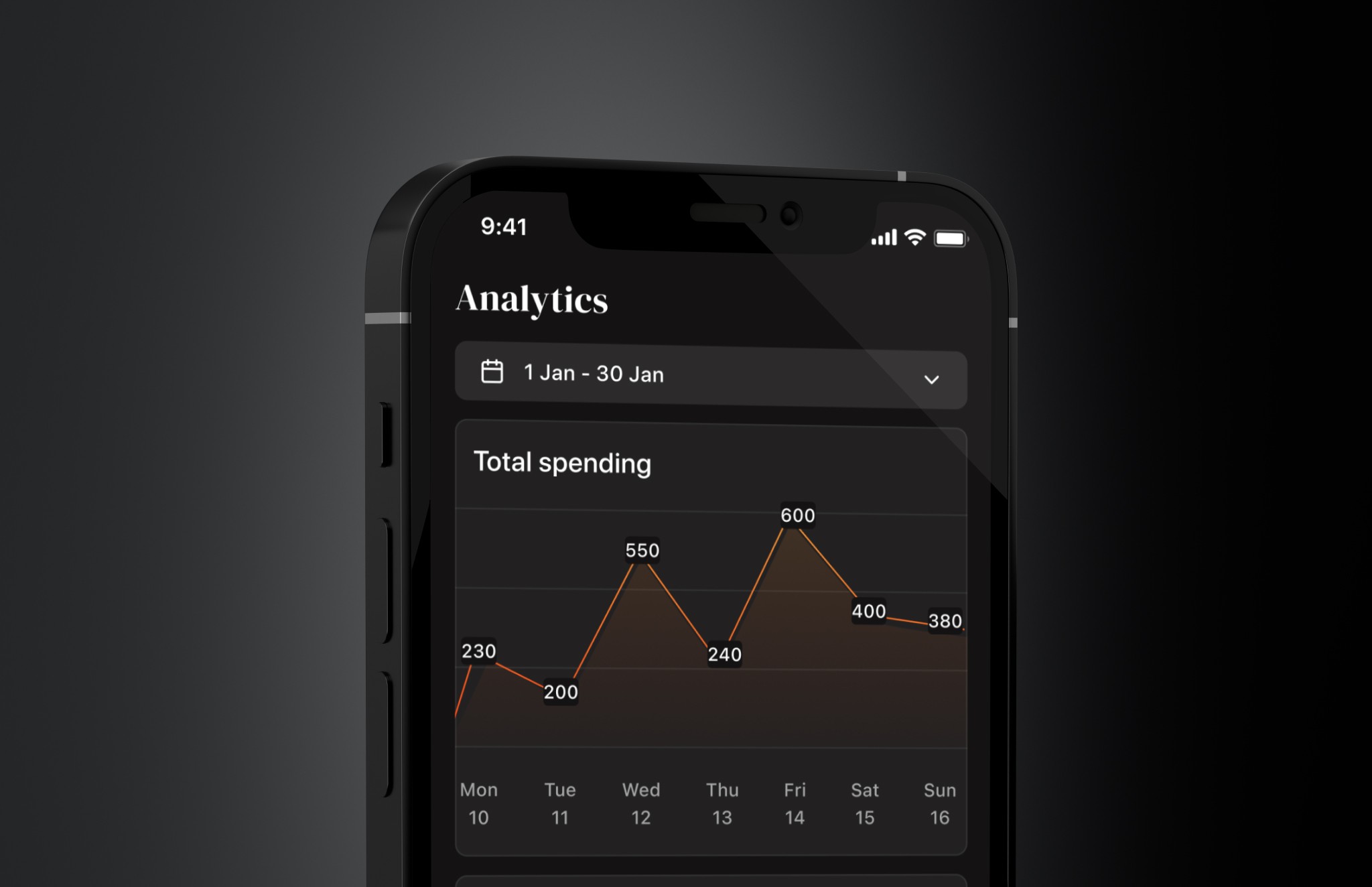
Analytics line graph view
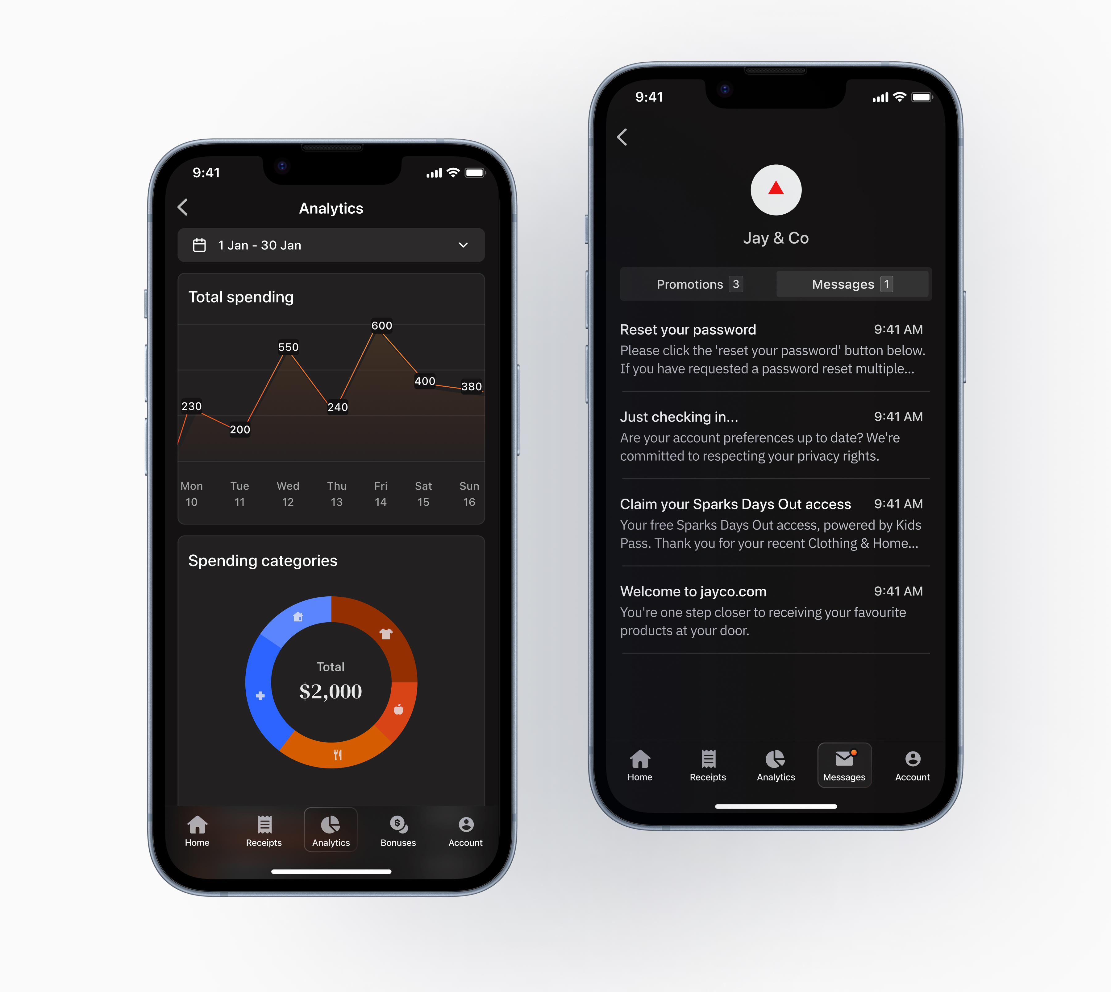
Analytics and merchant messages
Dark mode interface details
Accessibility
Accessibility
Dark backgrounds with warm accents create specific contrast challenges. I ran WCAG AA checks across every text and data surface - the amber on near-black pairing required the most iteration, particularly at small sizes. Touch targets were held to 44x44px minimum.
Outcome
Outcome
The product launched to a closed beta in April 2025. Early user feedback was positive - the experience was described as feeling distinctly different from other finance apps they had tried, which was exactly the signal we had been designing toward.
Reflections
What I'd Revisit
I'd explore a different serif pairing – one optimised for readability at smaller sizes, not just editorial impact at display scale. DM Serif Display earns its place in headlines, but there are moments in the product where something with better small-size legibility would have served the user better.