PAA: Scaling Clinical Efficiency through AI-Driven Workflows
Transforming a high-density data environment into a prioritized, actionable interface for post-acute care.
Role
Lead Designer
Context
Post-acute care platform
Team
2 PMs, Engineering
Platform
At a glance
- •Impact: The redesigned dashboard is live, shifting the team from reactive fire-fighting to proactive care management.
- •Efficiency: 40% time saved by eliminating the need to hunt for patient status and missed documents.
- •Execution: Introduced a tiered system with time-sensitivity categorization and contextual messaging integration.
- •Next: Analysis of user behavior to refine the AI categorization logic for future releases.
Overview
About PAA
PAA is an AI-based platform providing real-time predictive analytics to manage patient care in post-acute settings. As the lead designer, I spearheaded the dashboard redesign to solve critical bottlenecks in clinician task management. The goal was to transform a high-density data environment into a prioritized, actionable interface that reduces patient service delays.
The Challenge
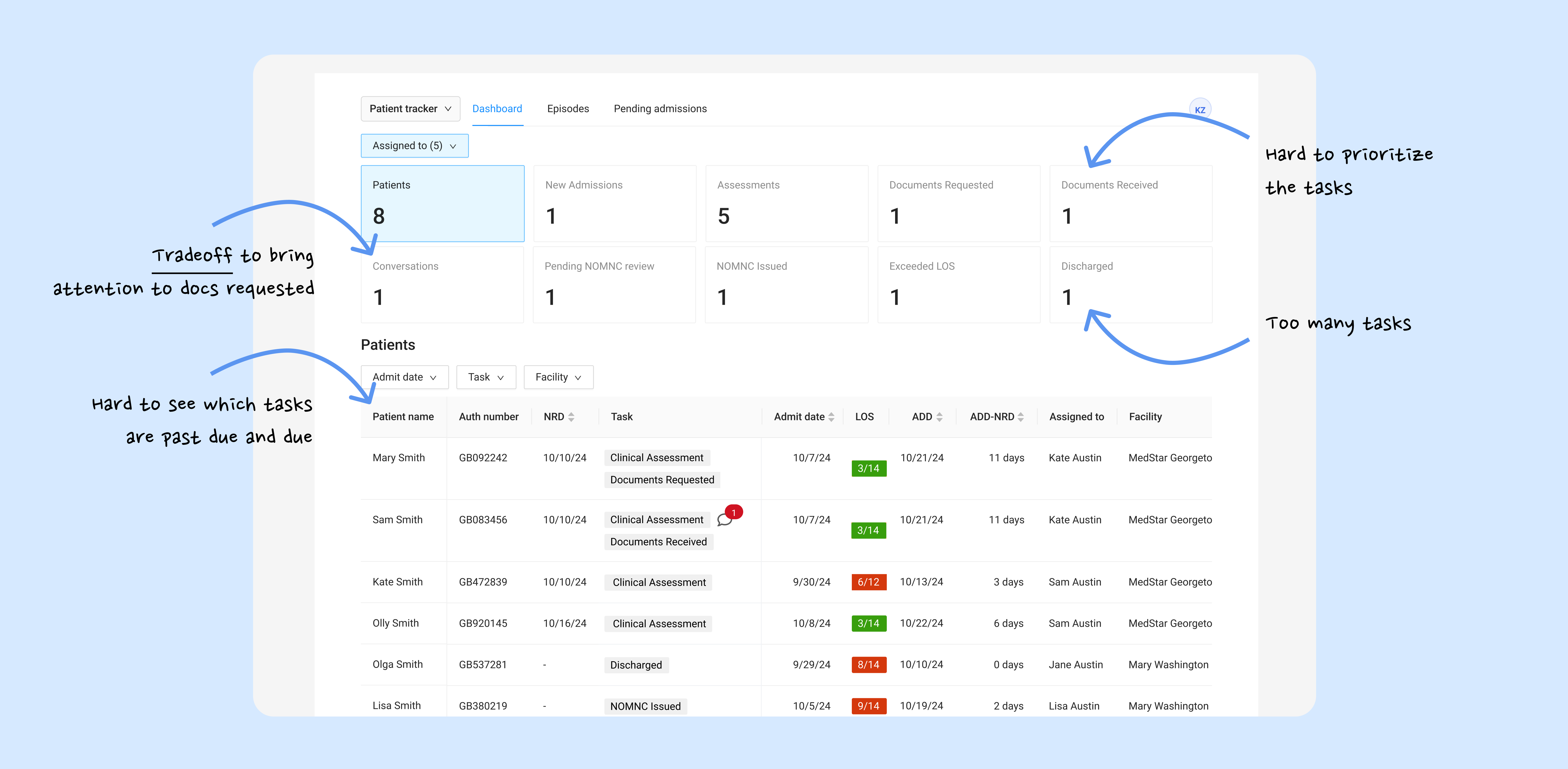
Clinicians drowning in a "flat" information architecture
The legacy system treated all tasks as equal, causing cognitive fatigue and missed deadlines.
Task breakdown by category and age with no clear prioritization cues
Prioritization Paralysis
No visual distinction between "past due" and "due today" tasks.
Information Silos
Critical document requests were buried in a separate chat tab, isolated from the clinical task list.
Service Gaps
Lack of urgency indicators led to a high volume of patients not being served in time.
Design Explorations
Balancing Density & Feasibility
I developed 30+ screen iterations, moving from high-level concepting to granular stress-testing with the engineering team.
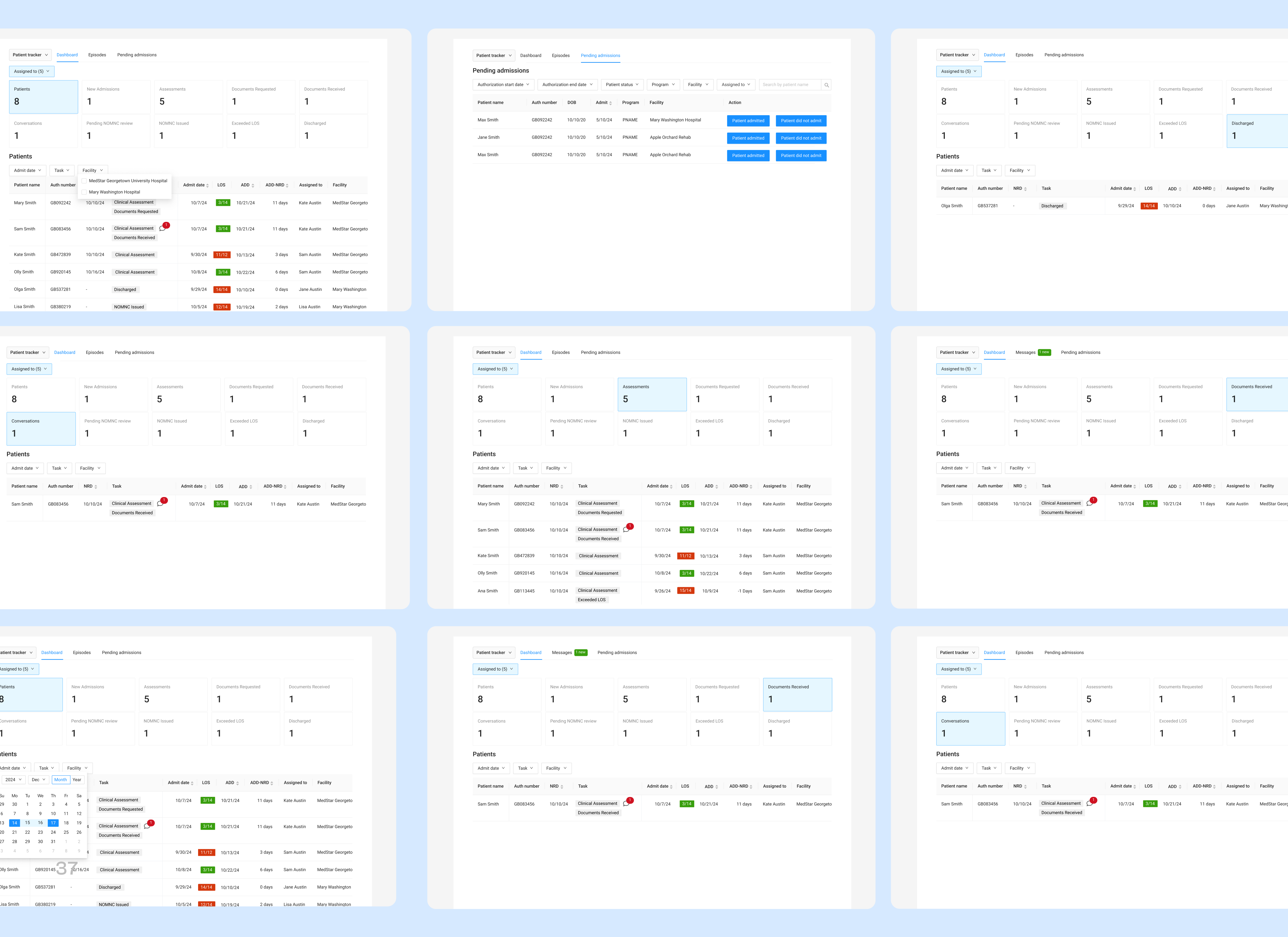
Design variations & key flows
Phase 1: Structural Discovery
I explored different mental models for task grouping. Initial wireframes focused on a unified feed, but user testing revealed that clinicians needed a "separation of concerns" between immediate risks and general maintenance. The first iteration introduced a patient table showing who needs to be served based on priorities, plus a suggested task categorization that covers the full care journey—from admission through discharge.
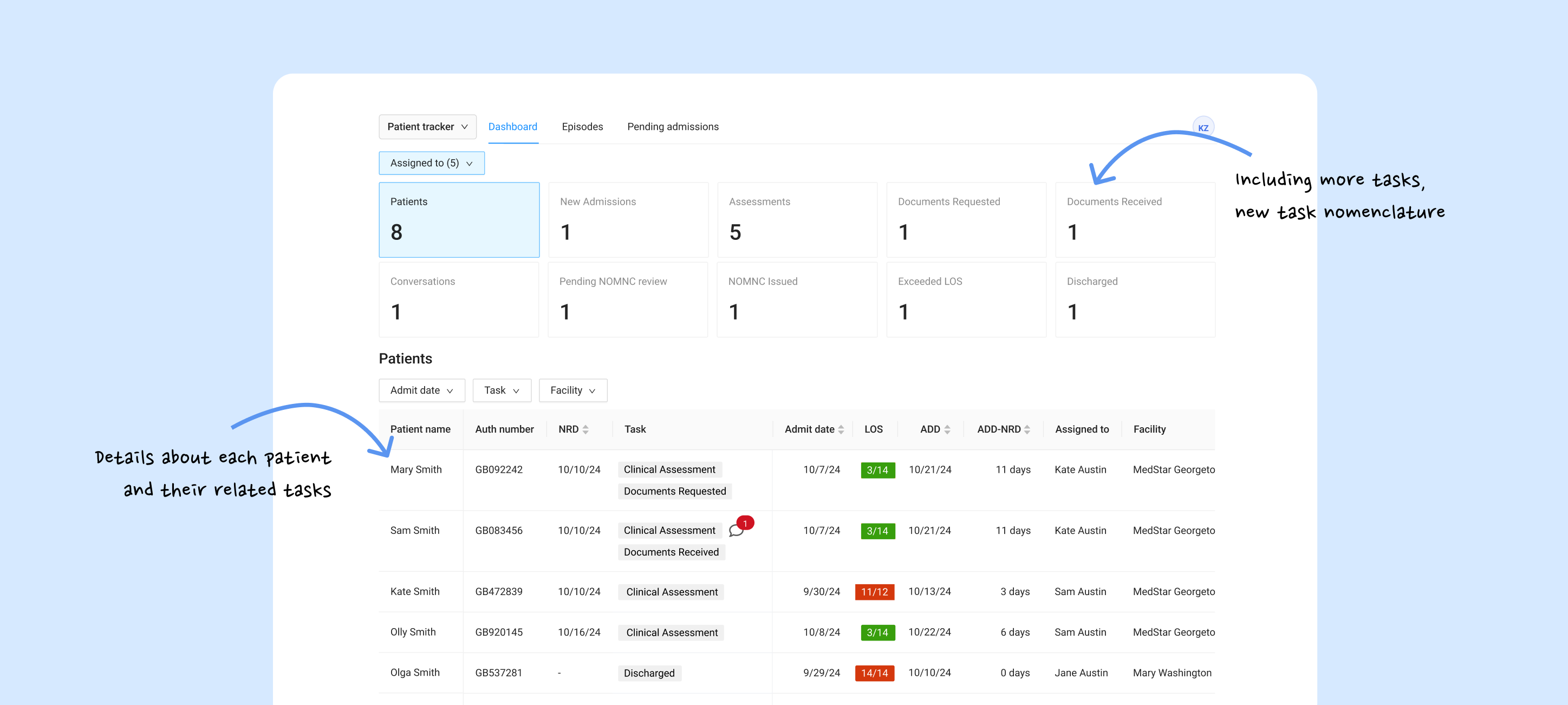
First iteration: patient table by priority and task categorization across admission to discharge
Phase 2: Technical Feasibility & Trade-offs
After validating the "Action vs. Overview" model, I focused on the micro-interactions. In a clinical setting, every extra click is a distraction. I audited the existing task flow and identified an opportunity to save 40% of clinician time that was being lost to hunting for patient status and missed documents.
I led deep-dives with the 2 Product Managers and Engineering to audit data latency. We debated the "Cost of Attention," specifically how to surface document requests from the chat without cluttering the clinical UI. This led to the "Actionable Tile" pattern, where "Unread Messages" are no longer hidden in the patient profiles but high-level entry points.
Instead of a separate chat tab, I implemented a system of slide-out drawers and modals that keep the patient's clinical data in view while discussing document needs.
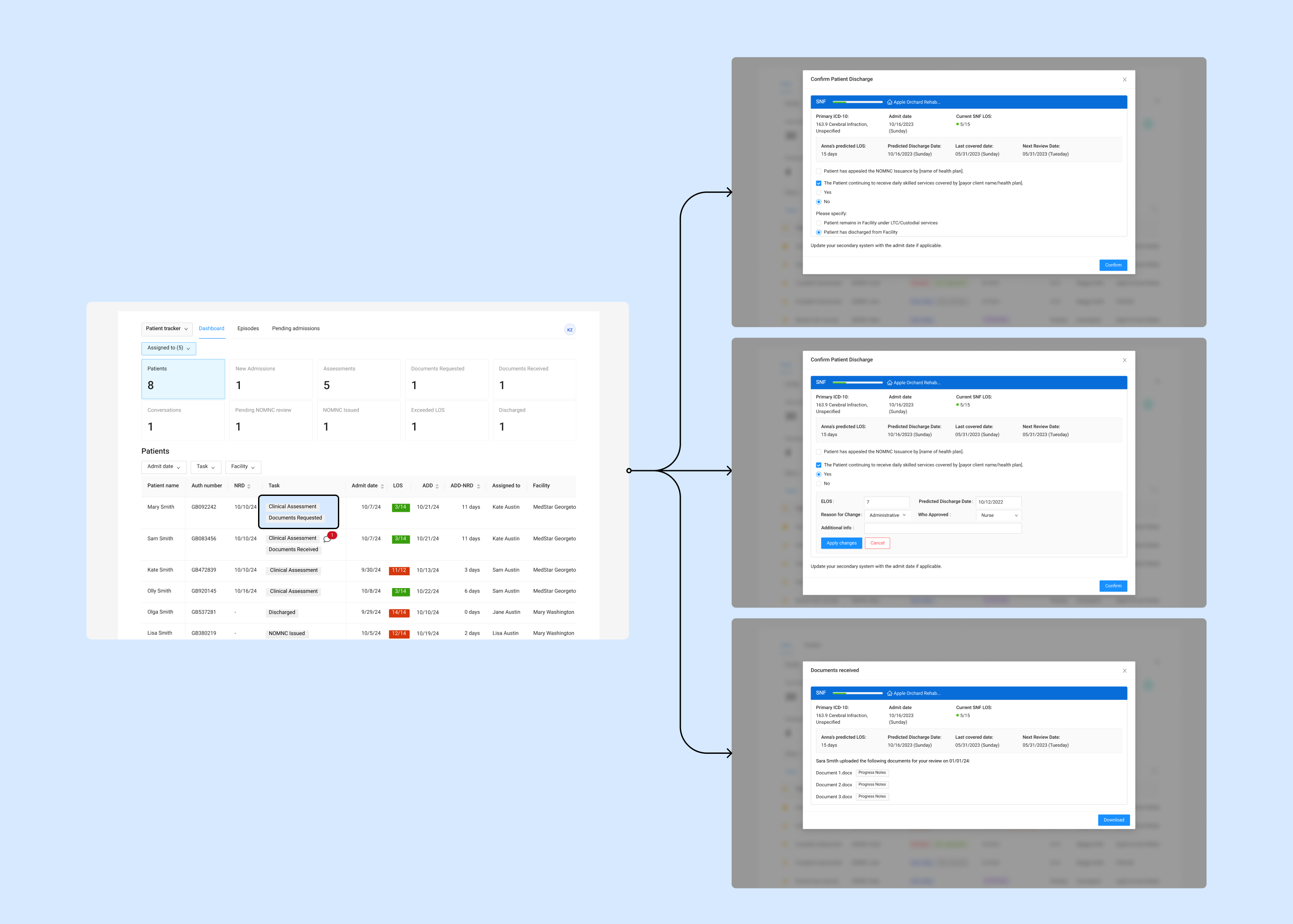
Modal with patient context in view
The Solution
A New Hierarchy
The final design introduces a tiered system that automates the clinician's triage process.
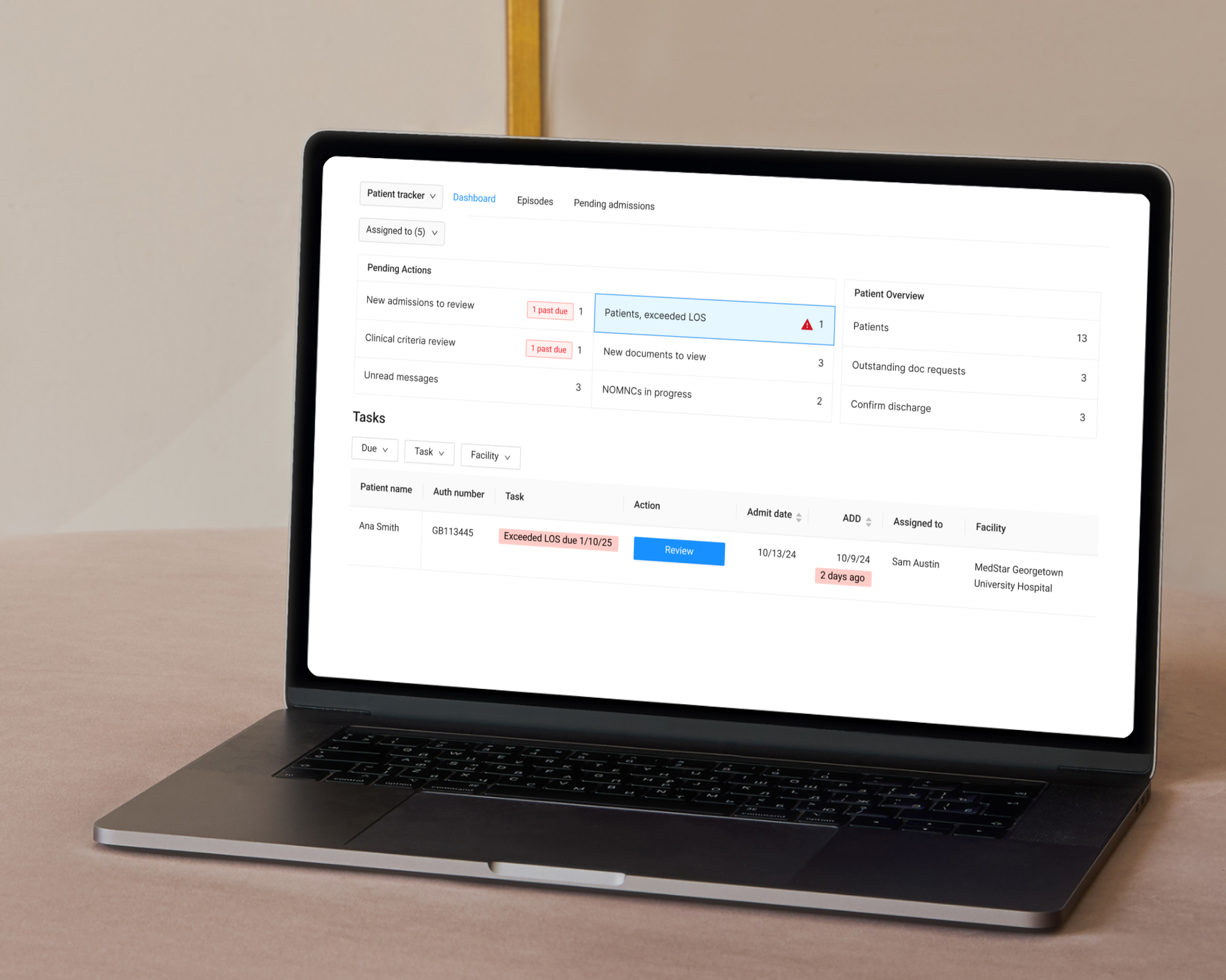
Pending Actions UI
High-contrast tiles at the top categorize tasks by time-sensitivity (e.g., "2 past due") for a quick status check.
Message Integration
"Unread Messages" now lives as a primary tile. Clicking a message surfaces a contextual chat overlay, allowing clinicians to review patient's requests without losing their place on the dashboard.
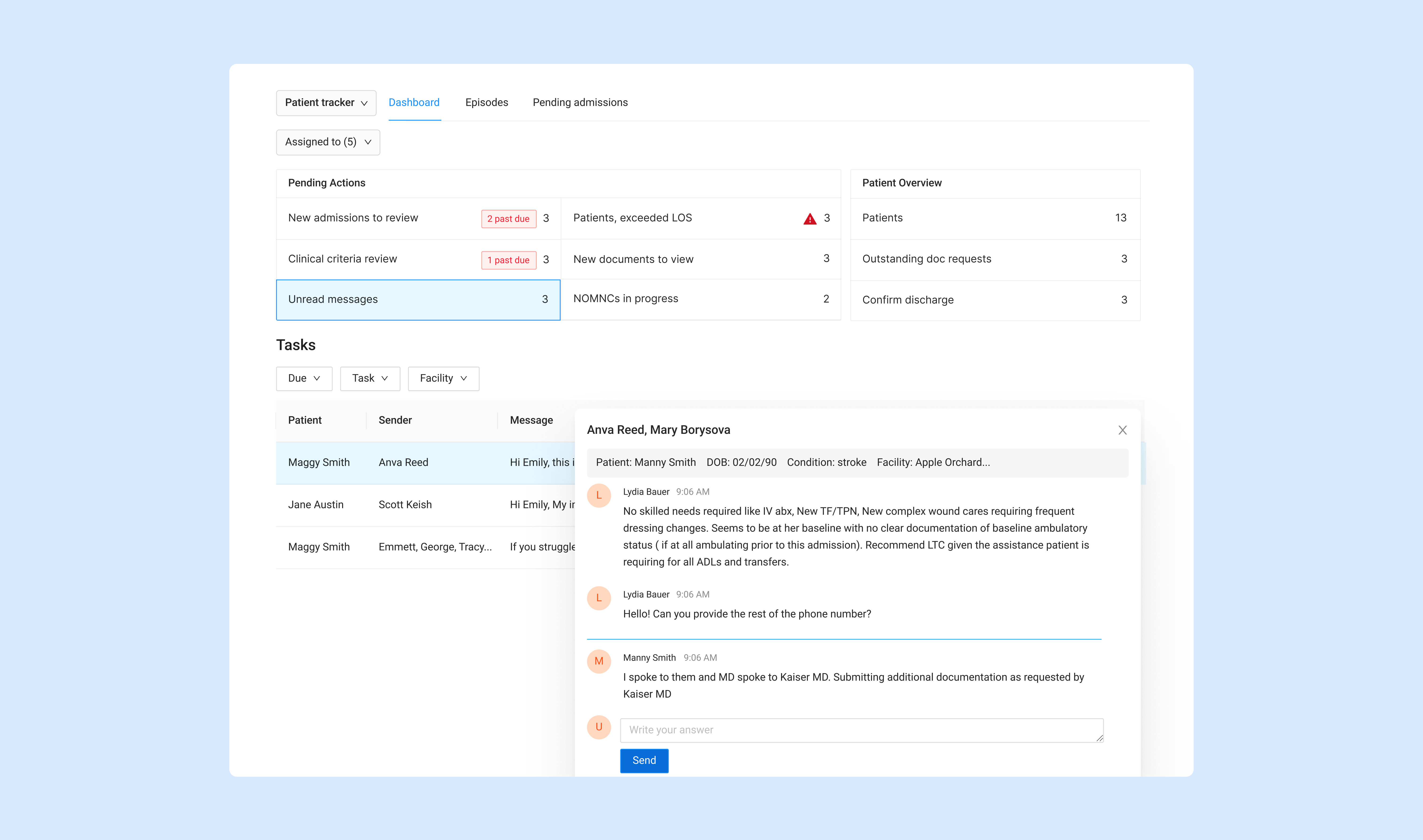
Pending Actions tiles, patient table with urgency indicators, and contextual message cues
Zero-Layer Actions
The task table below provides granular control, allowing clinicians to filter by "Due" date, "Task" type, or "Facility" to manage their specific workload.
The Outcome
Shifting from reactive to proactive care
The redesigned dashboard is live, shifting the team from reactive fire-fighting to proactive care management. Clinicians now have a clear view of what needs attention and can act on it without getting lost in a flat list of tasks.
Primary KPI
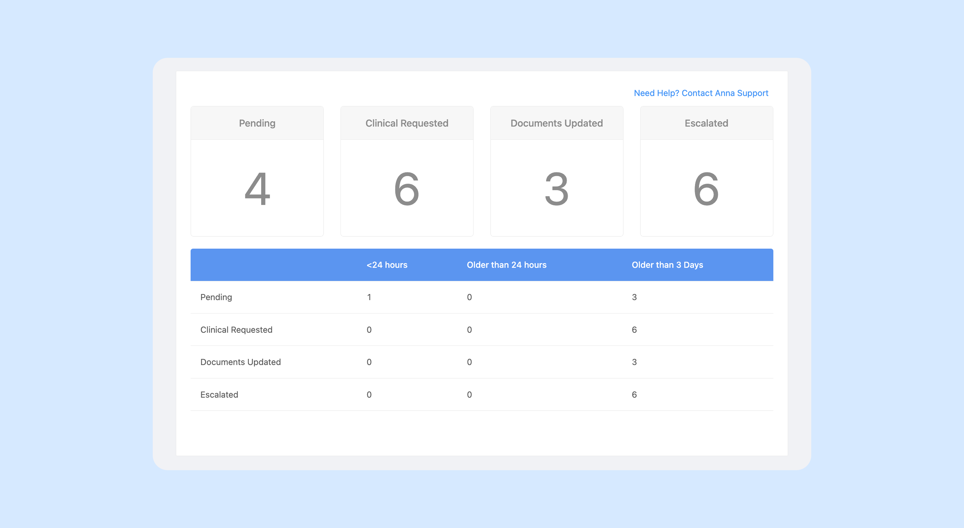
Tracking the reduction in "Past Due" task volume per clinician.
Quantitative Metrics
We are tracking the reduction in "Past Due" task volume and the average "Time-to-Action" for new document requests.
Qualitative Feedback
Early feedback indicates a perceived improvement in daily workflow efficiency and much higher clarity regarding task categorization.
Next Steps
Analysis of user behavior to refine the AI categorization logic for future releases.